Optimizing
Datawise
Enhancing the reliability of data in production processes through strategic design.
As the Senior and Sole Product Designer, I led the entire project lifecycle, overseeing tasks from requirements gathering to strategy, wireframing, and content management. Actively contributed to ideation and creative problem-solving sessions with both product and development teams.
🗓️ project date: 2023
🏙️ Company: Aperio
🖥 project type: Desktop, b2b Saas app
👩 my role: Senior Product Designer
Project summary:
In this latest redesign, Aperio sought to amplify attention on its primarily aggregated channels. The goal was to revamp the hierarchy, uphold the aggregation UI, and optimize data visualization—enhancing the overall user experience for a more engaging and personalized interface.
The challenge:
In 2023, the user experience of the Aperio Datawise, a SaaS app, underwent a comprehensive revamp.The redesign aimed to alleviate visual overload and place a heightened emphasis on its core features—specifically, monitoring anomalies in sensors within the manufacturing process.
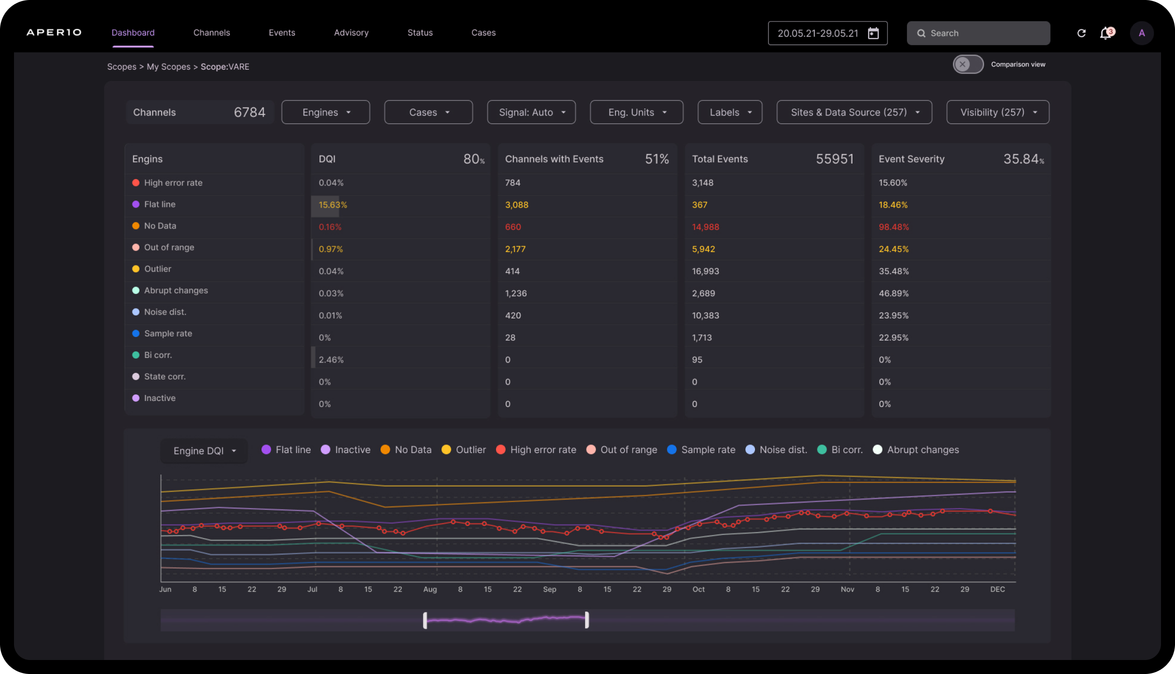
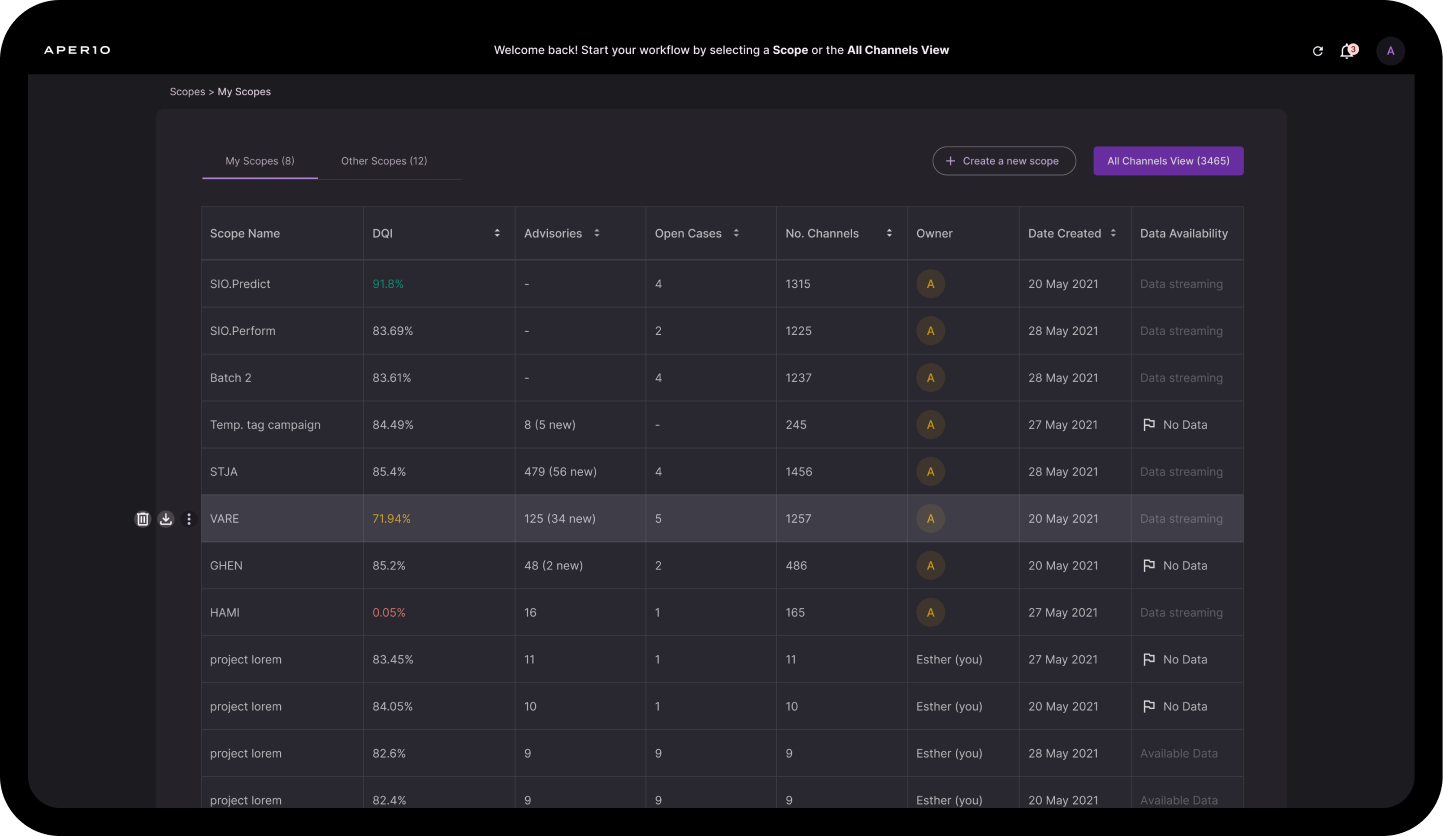
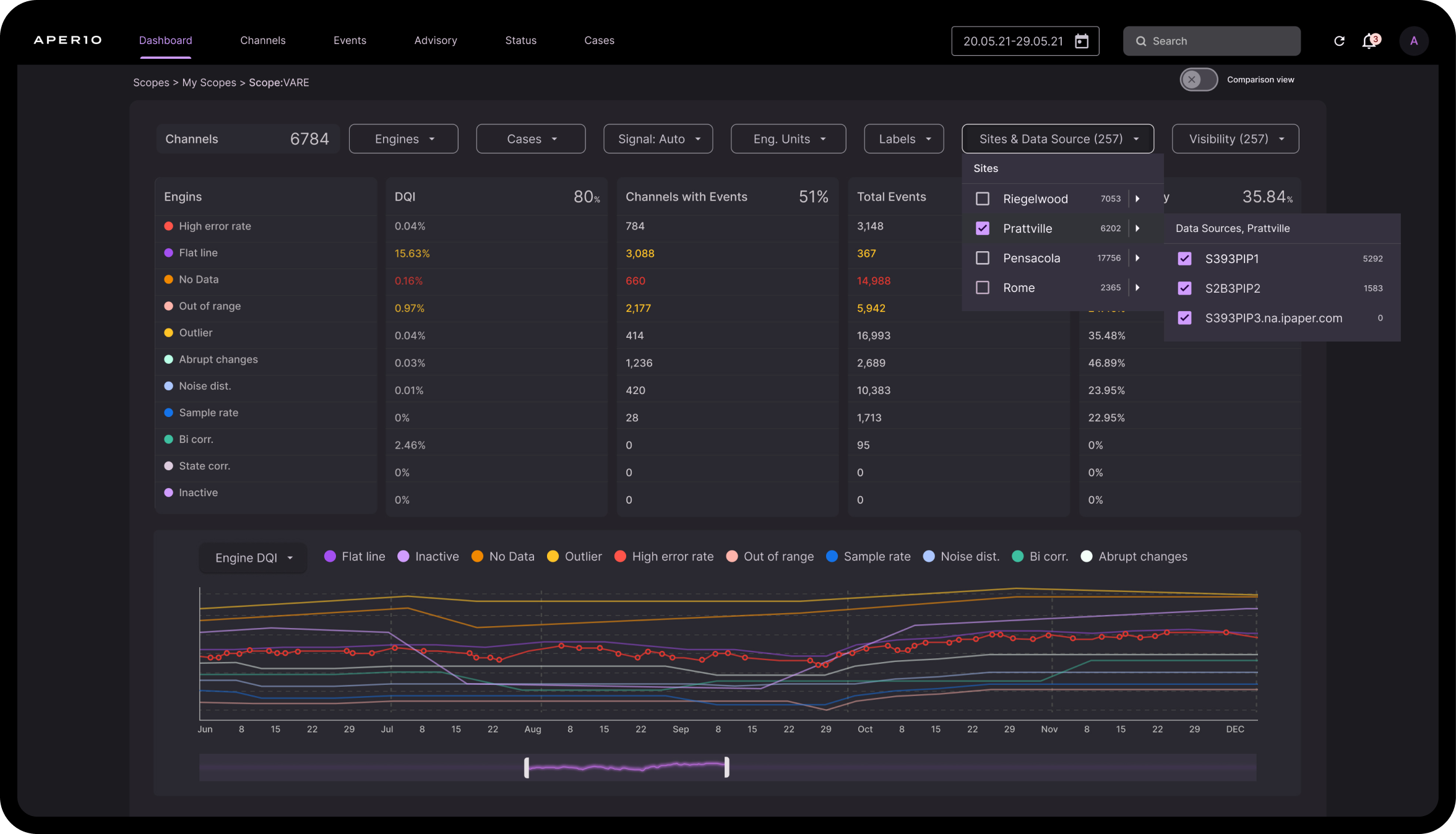
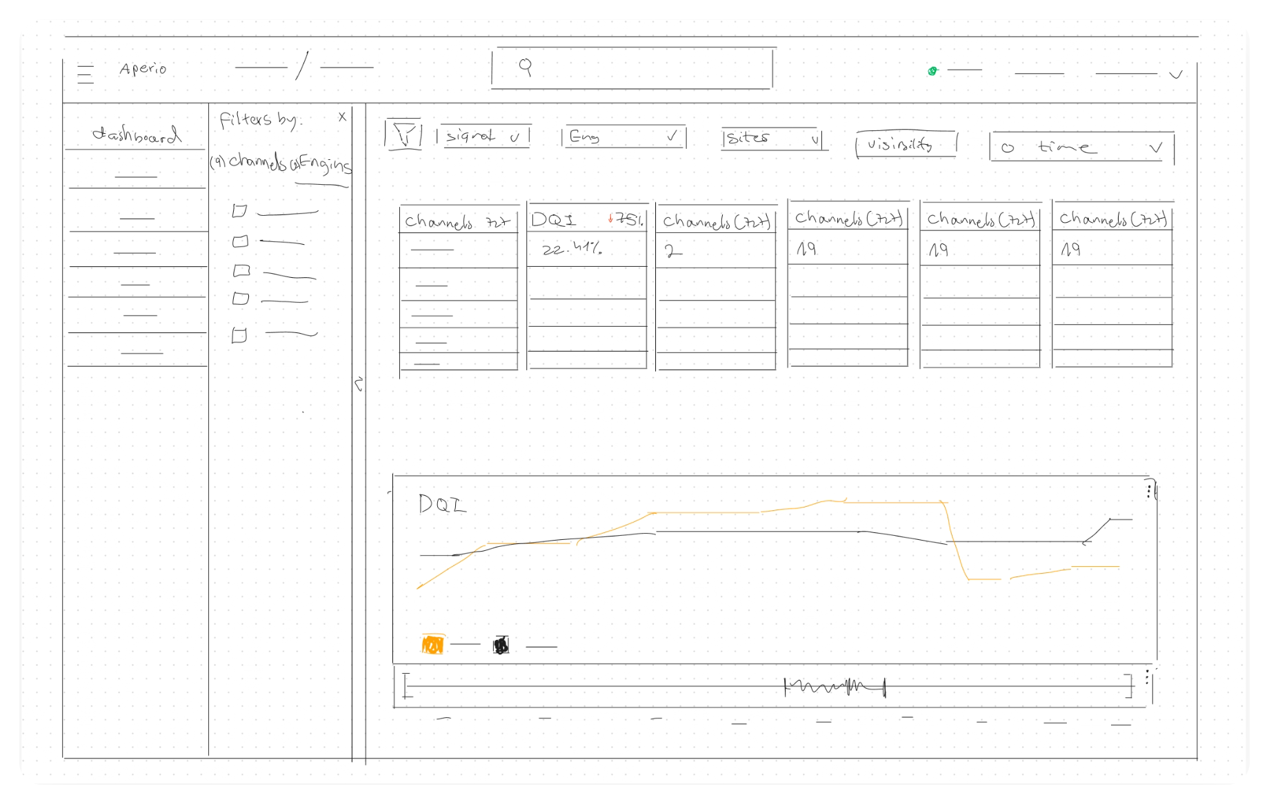
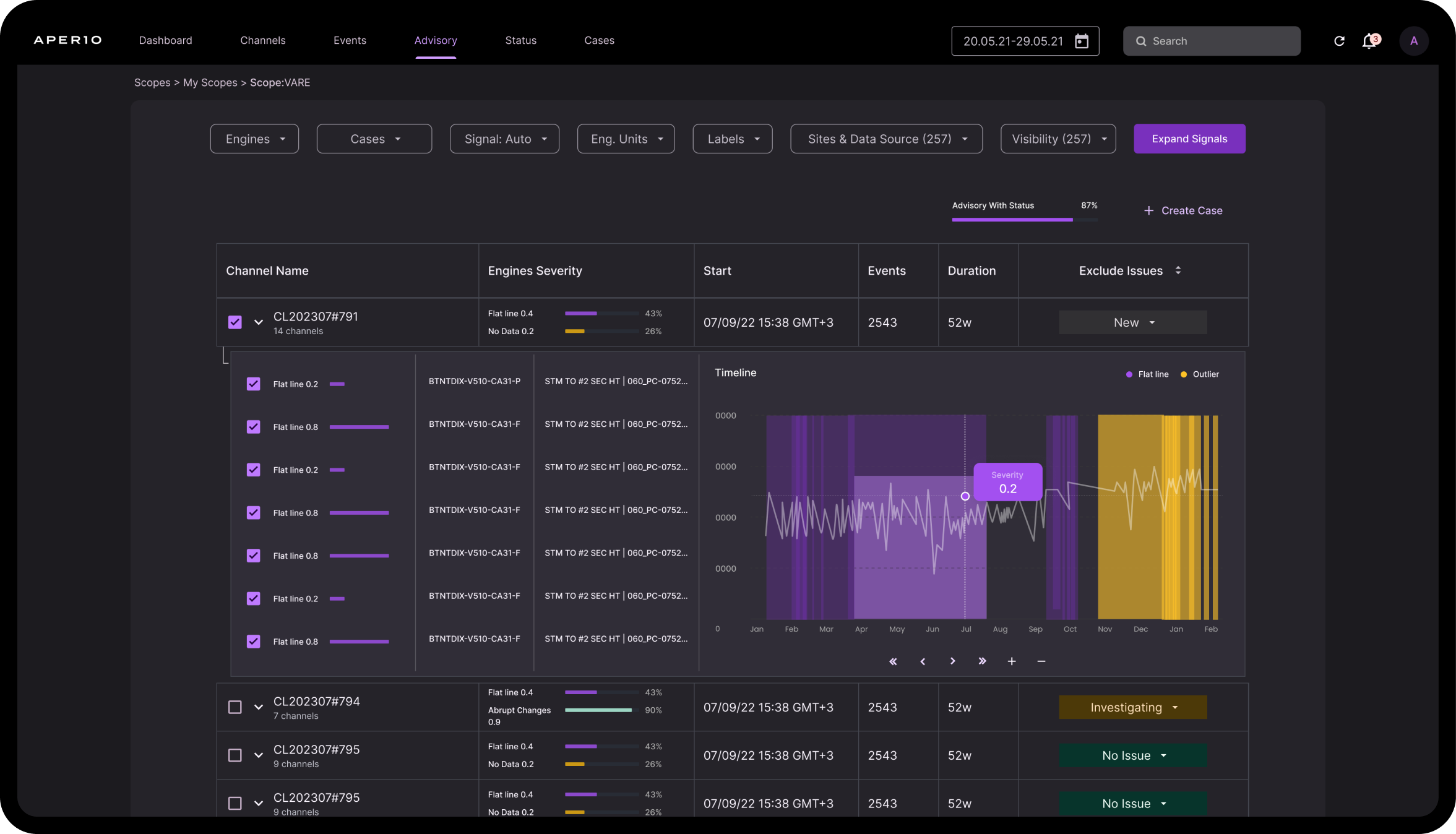
Redesign of Datawise's dashboard within the selected scope.
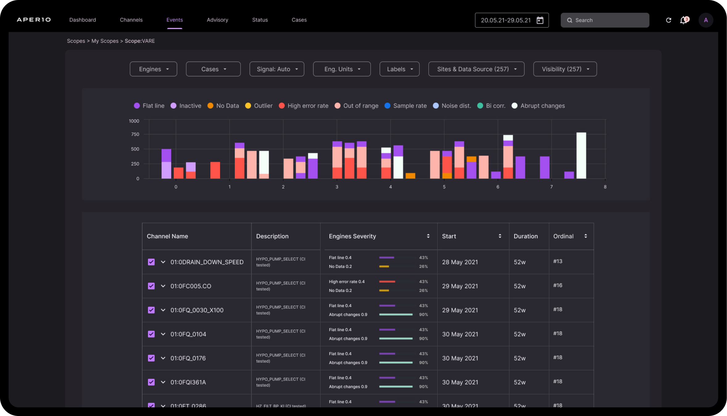
The user task is to investigate data and analyze anomalies in selected channels to ensure reliable data
user needs
Aperio Datawise users, spanning roles from directors to engineers,demand comprehensive data tools, strategic insights, and predictive analyticsfor efficient manufacturing, quality optimization, and data integrity assurance.
This redesigned app must address their specific needs, emphasizing a user-centricapproach to deliver a tailored and efficient Aperio Datawise experience.This will allow them to concentrate only on the aspects of their role that are pertinent to them.
Solution
Process: The set of steps taken to address the project goals.
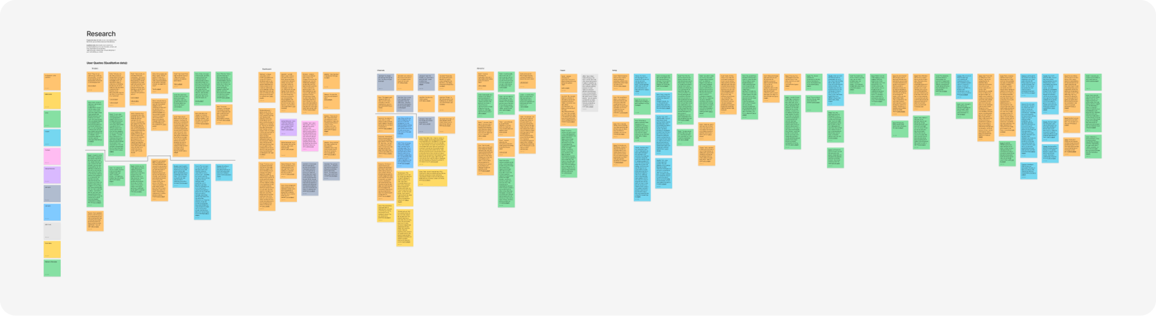
RESEARCH:
- Context study
- User interviews
- User pain points
- Competitive audit
IDEATION:
- Feature narrative
- Jobs TO Be Done
- Design principles
- Journey map UX flow
FEEDBACK:
- Mixpanel data analysis
- user testing
- Designer critiques
- Stakeholder reviews
Visual Process
Analysis Process
Decoding UX Patterns for
Informed Design Decisions
As part of my investigation, I reviewed dashboard features andimproved adjustments to the dashboard.
RESEARCH
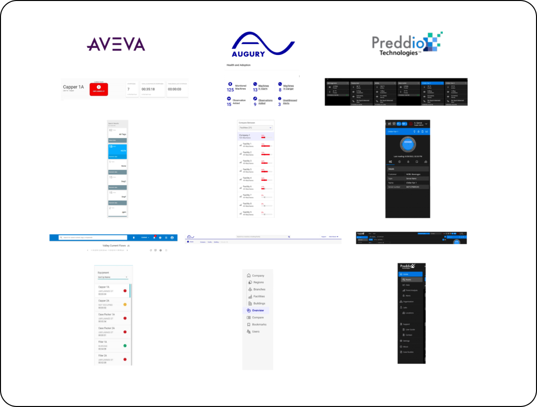
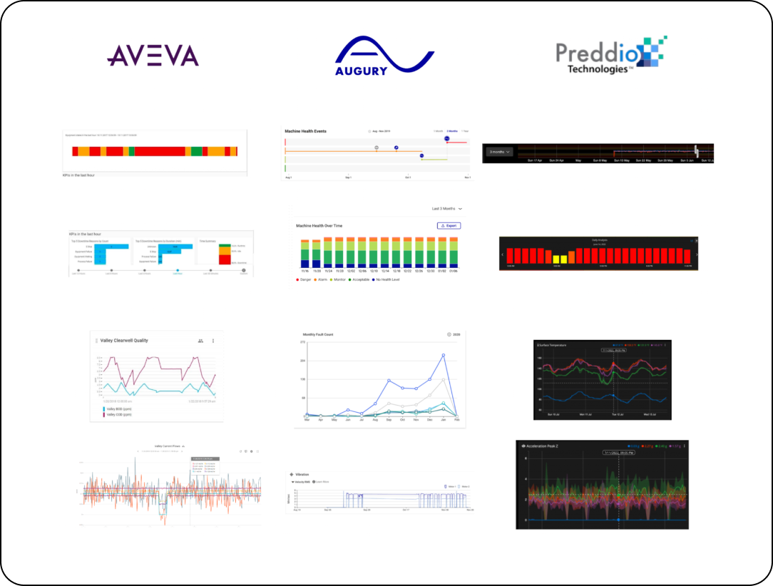
Conducted a comprehensive context study, identified user pain points through interviews, and performed a competitive audit. Analyzed categories and filters to enhance information retrieval, ensuring users find and understand data efficiently. Explored UX patterns, including features, hierarchy, and navigation, in the competitive landscape, identifying similarities to inform design decisions.
Methods
How did we solve the problems?
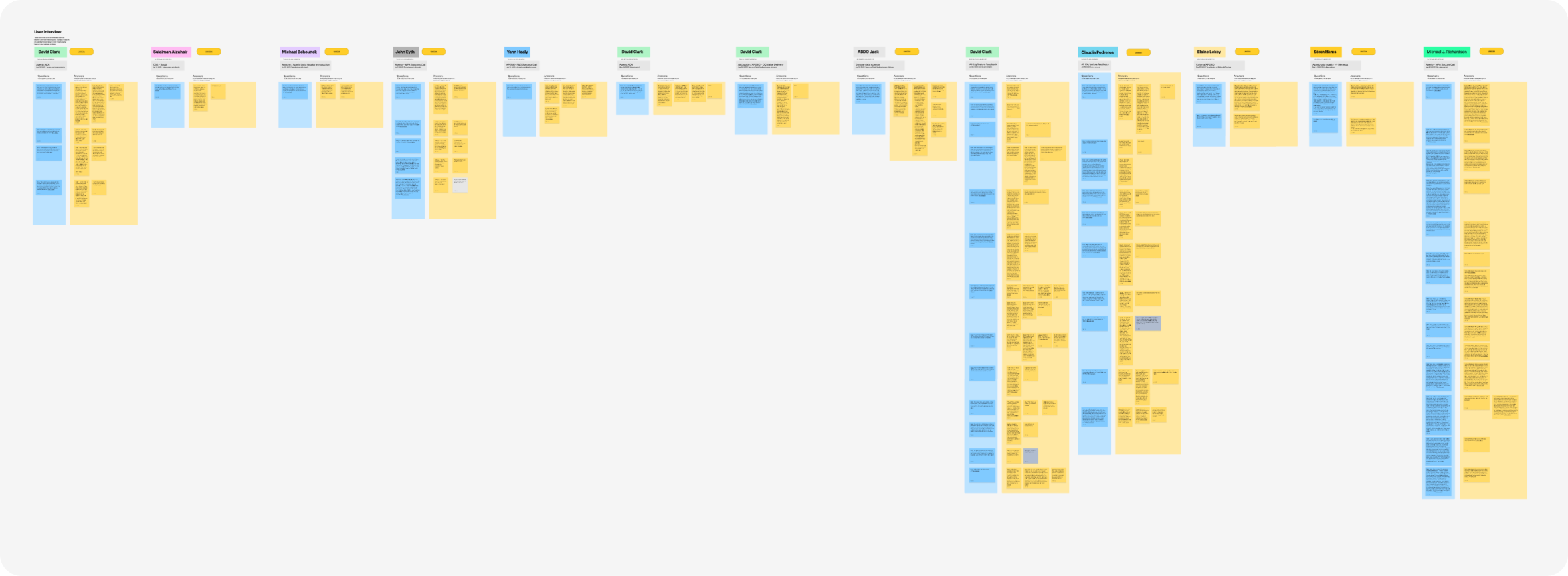
Interviews:
We engaged in insightful semi-structured interviews with 10 Aperio Datawise users, delving into their experiences and the app's challenges. Gong recordings facilitated a thorough analysis of their interactions and highlighted key issues for exploration and improvement. Based on the answers to our question, we mapped the needs of the different users and roles.
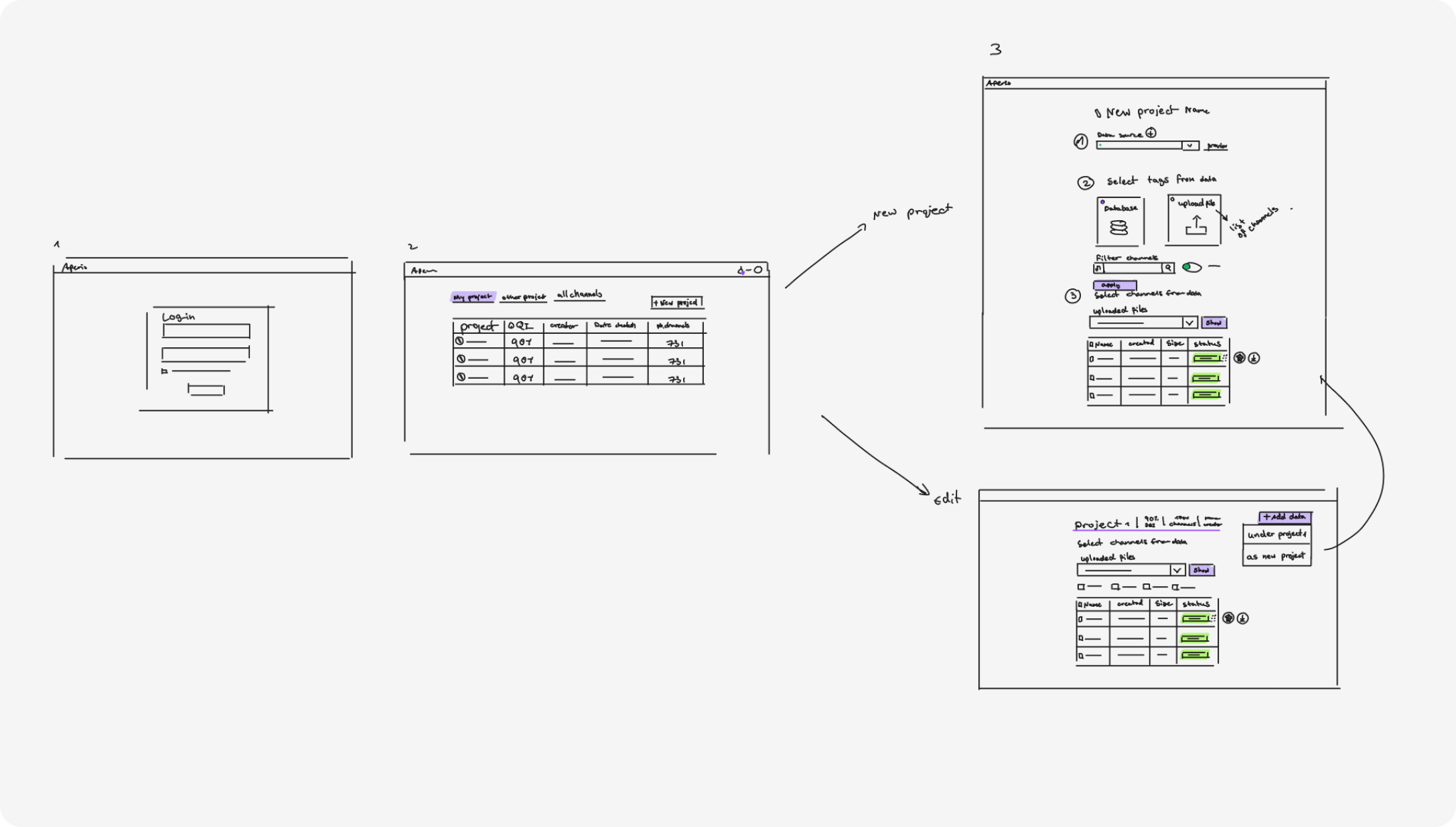
An overview of the scope flow is shown in the following sketches
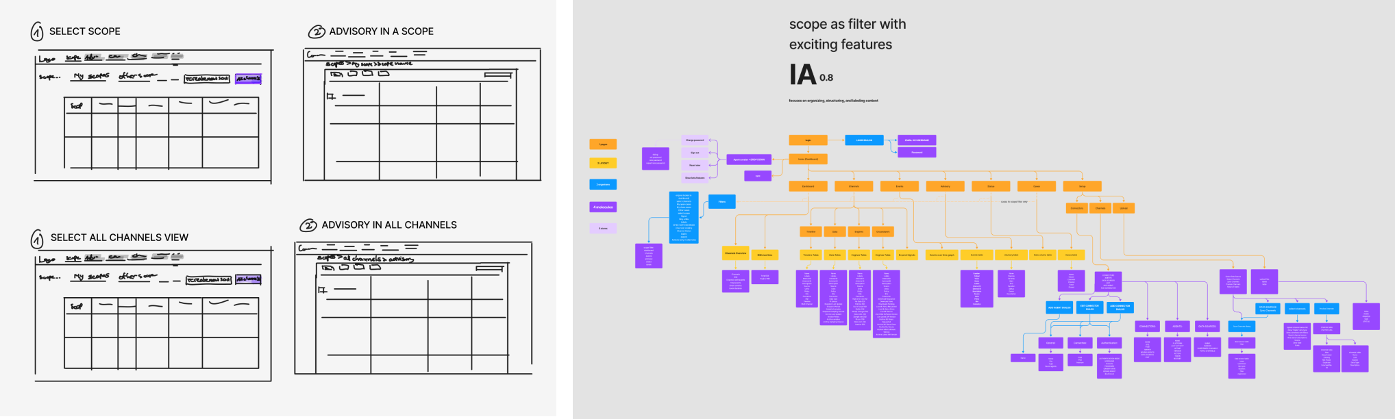
Scope flow sketches from the second iteration and the information architecture for scopes
IDEATION
In ideation, I utilized various methods—feature narratives, Jobs To Be Done, design principles, and UX journey maps. My solution focused on targeting sensors to enhance data quality, reducing undetected events, and ensuring users rely on collected data. This approach addresses the risk of users using inaccurate data, missing valuable insights into manufacturing processes. By prioritizing a user-friendly "dashboard" aligned with searches and data inputs, Aperio aims to recalibrate sensors, improving production efficiency and meeting user needs effectively.

Utilized feature narratives, Jobs To Be Done, design principles, and journey maps in ideation. Focused on addressing sensor-related issues for accurate and reliable data in Aperio.
The user task is to investigate data and analyze anomalies in selected channels to ensure reliable data
Features
Streamlined Core Features and Enhanced User Roles for Intuitive Data Exploration:
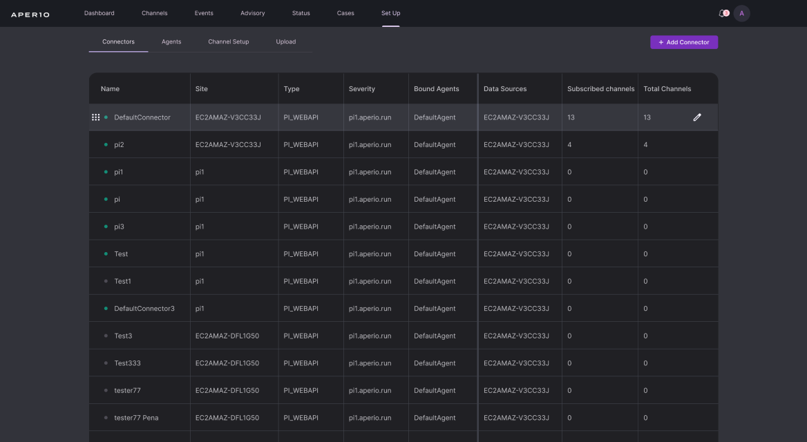
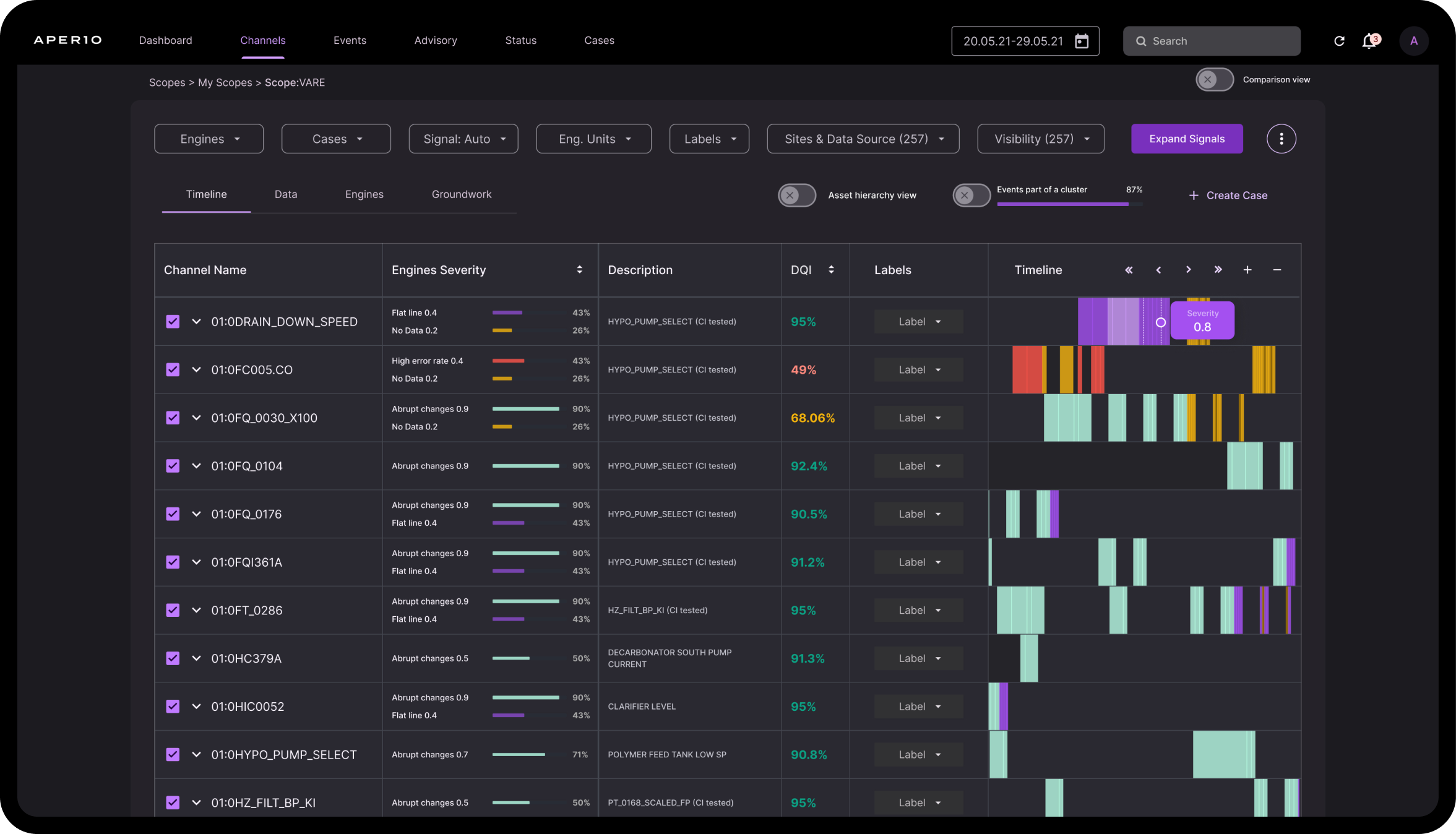
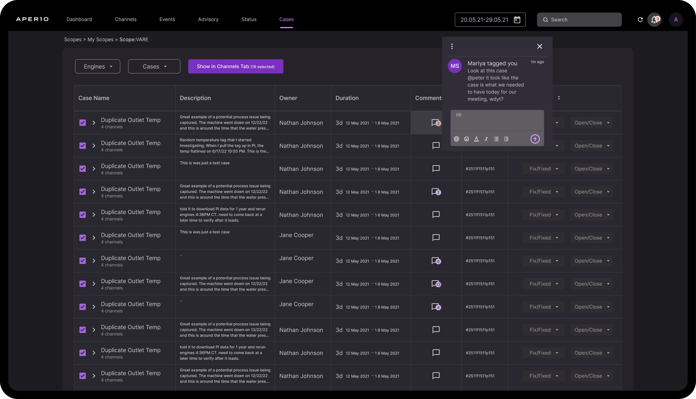
we improved engine visibility, introduced a user-friendly menu, and implemented color-coded DQI results for clear data health insights. The redesigned app now starts with a scopes view, empowering users to create customized dashboards, ensuring a seamless and efficient app experience. Additionally, we enhanced the hierarchy, UX flow, and collaboration tools, prioritizing user needs, and facilitating improved self-data uploading.
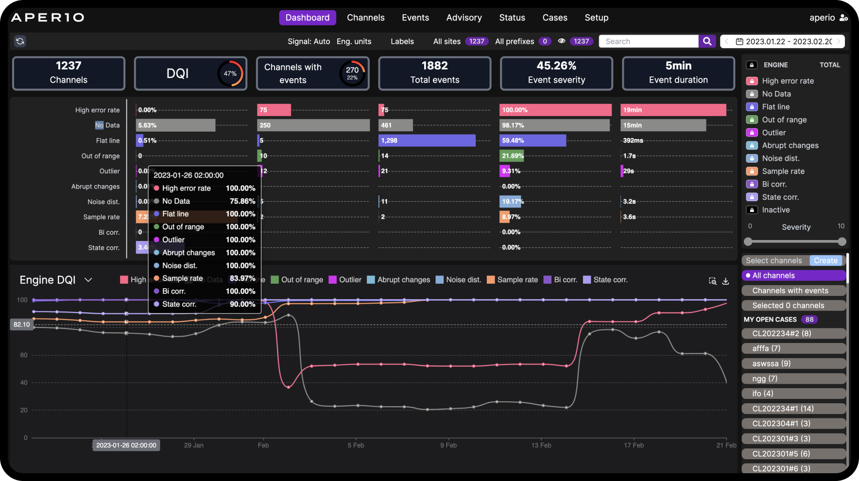
Aperio dashboard before revamp and new scope features
Wireframe of the dashboard layout and ux patterns
The first iteration of the dashboard design
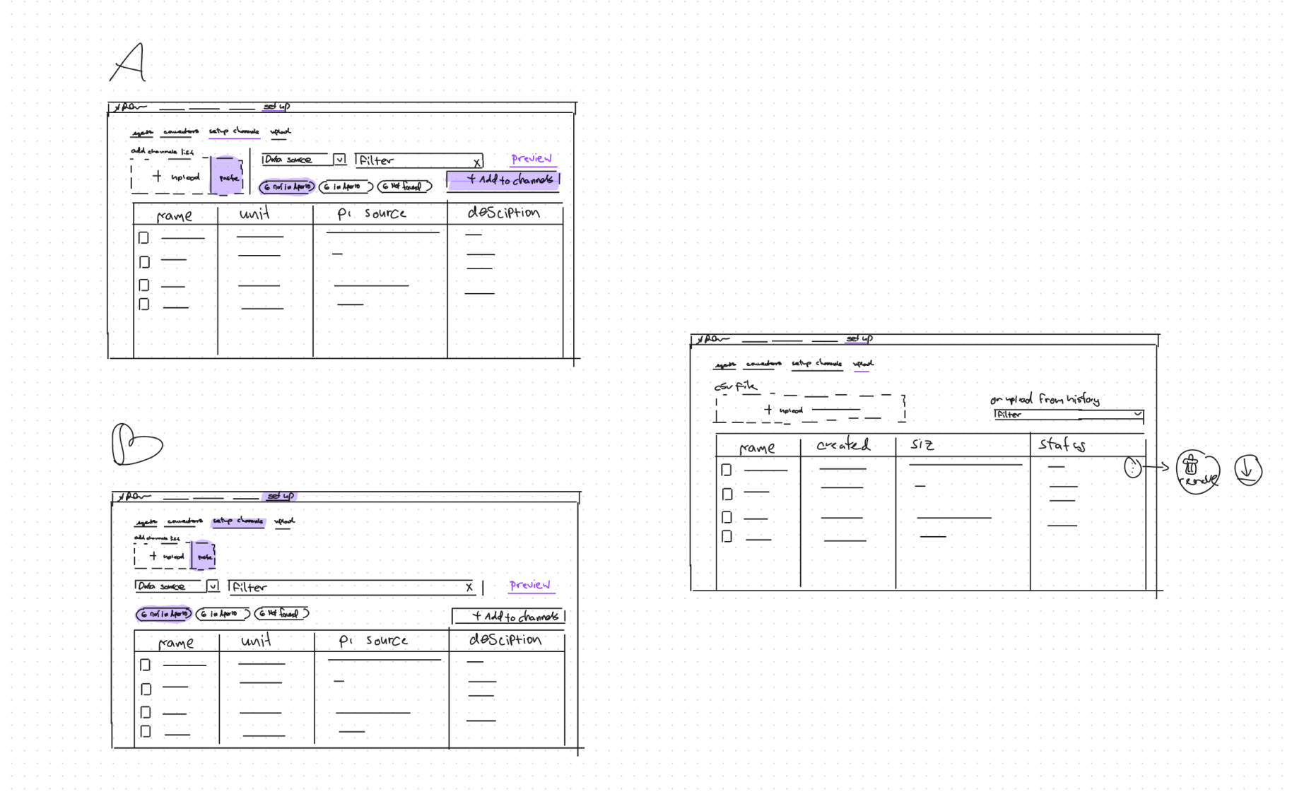
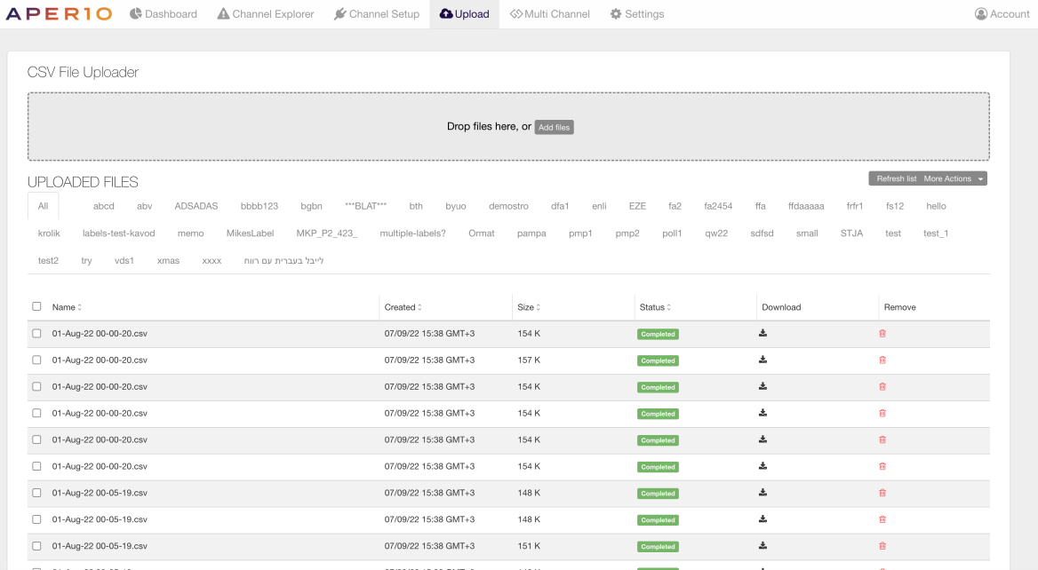
Design sketches for the uploading data flow
Setup flow before revamp
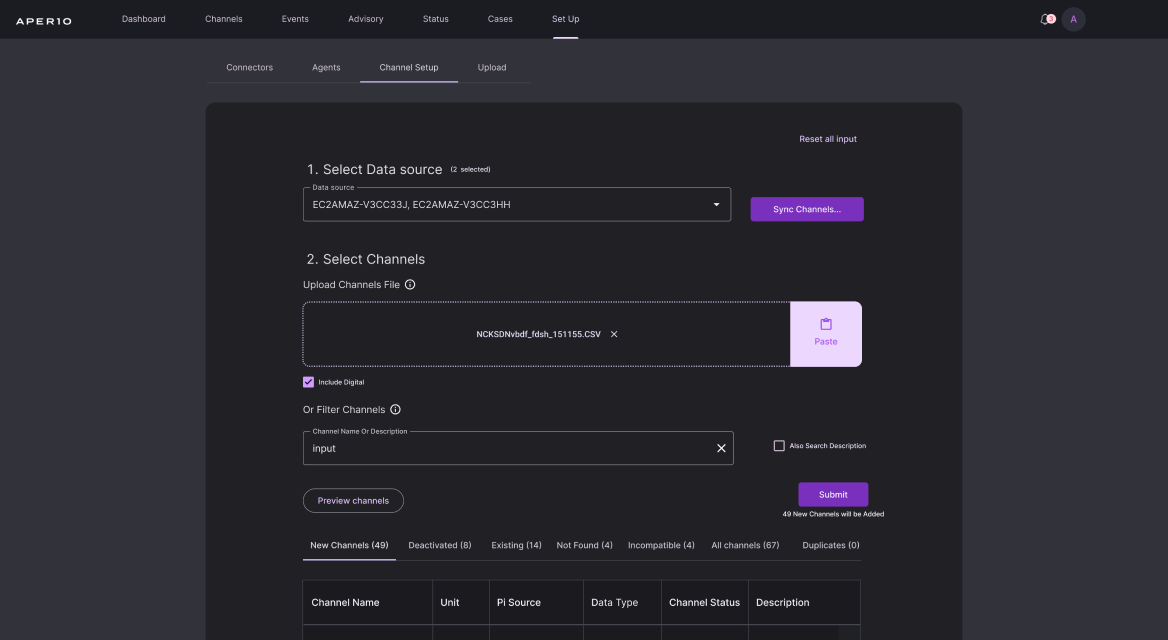
Setup flow after revamp
Results
Project Success Metrics:
Clients embrace collaboration tools, boosting engagement and increasing page views. Streamlined customer success services, saving time on assisting with new data streaming connections in Aperio.
Reflection
Project Hindsight:
Immersing in customer interactions and crafting personas, even in seemingly straightforward redesigns, empowered confident UX flow changes beyond UI. Mapping customer touch points revealed valuable insights, fostering cross-team collaboration and shedding light on user experiences.
HI-FIDELITY
PROTOTYPE

Testimonials
What users think of the project
"The redesigned dashboard brings incredible value with its high level of customization. Recognizing the diverse end-user landscape, the role-based approach ensures tailored views aligned with best practices for specific roles. Assigning users to roles enhances the overall user experience, making it a definite recommendation."
David Clark, center director Air Liquide
Next
project
Up for taking your project to the next level?
Let's talk design
and whip up some
precision solutions!
Email for Collaboration
Hi, I'm Chen Edri, a UXUI designer
specializing in SaaS and mobile apps.